NOTE: New to the Steel Explorer? Read about it here.
Welcome
The purpose of this post is to highlight things that come to mind when reflecting on my time designing, iterating, and building the Steel Explorer. Some are tips, some are tricks, and some are learning lessons. Enjoy!
Design thoughts
-
Prior to starting the design phase of a new project, try to determine magnitudes, minimums, and maxiumums of your data set. My first iteration of the design for the Steel Explorer only accounted for ~50 beams, but things completley fell apart once all 284 beams were rendered.
-
Design with a minimum screen resolution in mind, driven by actual site statistics if you have them. My initial designs assumed a resolution of 1600px by 900px, which I soon realized only accounted for about 15% of my site traffic. This mistake set me back several weeks and forced me to redesign and reengineer several charts for a screen resolution of 1280px by 768px.
-
When filters are applied to the data, visibly modify elements which do not meet the criteria. For example, beams which are filtered out in the Moment Chart have a reduced opacity and a lighter shade of grey. A transition between states can also assist to make the change less jarring.
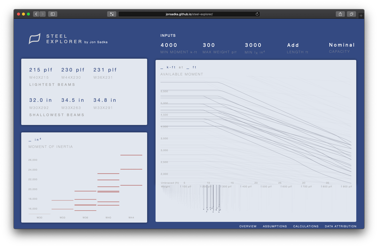
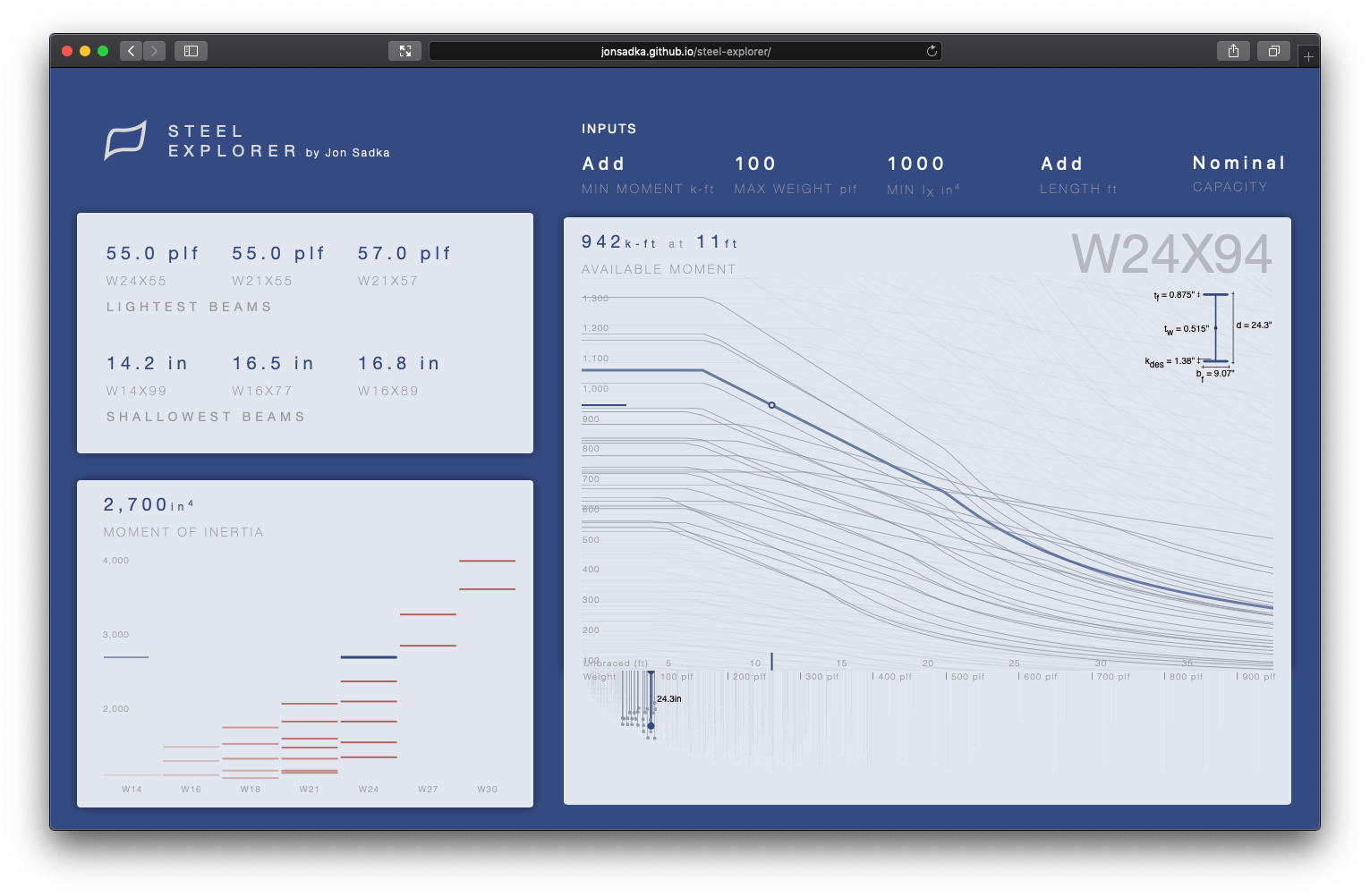
- Zoom into a filtered dataset to reduce noise from elements which are no longer useful. Do not zoom into a dataset when the context of adjacent elements are useful. For example, zoom is not enabled on filtering for the Distribution Chart because the weight and depth of other beams are useful to see.


-
Adding a transition animation when zooming in and out of a chart helps with spatial awareness.
-
Cross linking the charts on filter and hover interactions helps expose additional, potentially relevant, information to the user.
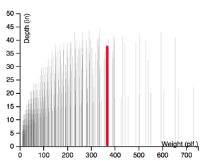
- Use direction (up, down, left, right) in your charts to help make a connection to the physical world. For example, steel beams in the real world are always top aligned and their depths are always measured down. This influenced the design direction of the Distribution Chart [first iteration on left, top aligned iteration on right].

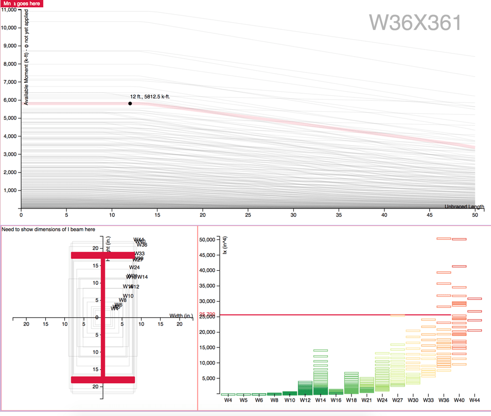
- Less is more. Remove elements, labels, legends, titles, etc. you don't need or can be easily inferred by the user. On personal computers, you can leverage the hover animation to expose additional information. My original designs had a dedicated chart showing the beam profile [left figure, bottom left chart], but I soon realized that the beam profile was only relevant when a single beam was selected. The beam profile was de-prioritized as a dedicated chart but appears on hover [right figure].
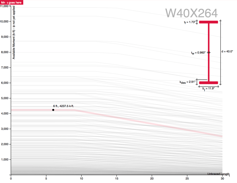
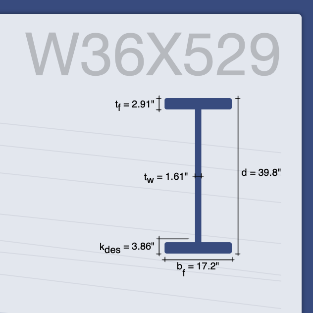
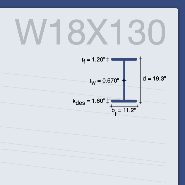
- When spatially comparing elements, overlaying them on top of one another helps point out small changes. I used this technique to point out differences in beam dimensions when scrubbing through the chart.
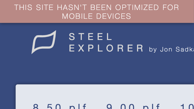
- Early in development, be deliberate about supporting mobile. Not every tool needs to support a mobile device and the Steel Explorer is one of them. That being said, the Steel Explorer is embarrassing on mobile. It's so bad I added a banner on mobile devices.
- Take snapshots of your design iterations along the way. It's makes you realize how much progress you have made and is fun to reminisce on once the project is done. You can see mine here.
Engineering thoughts
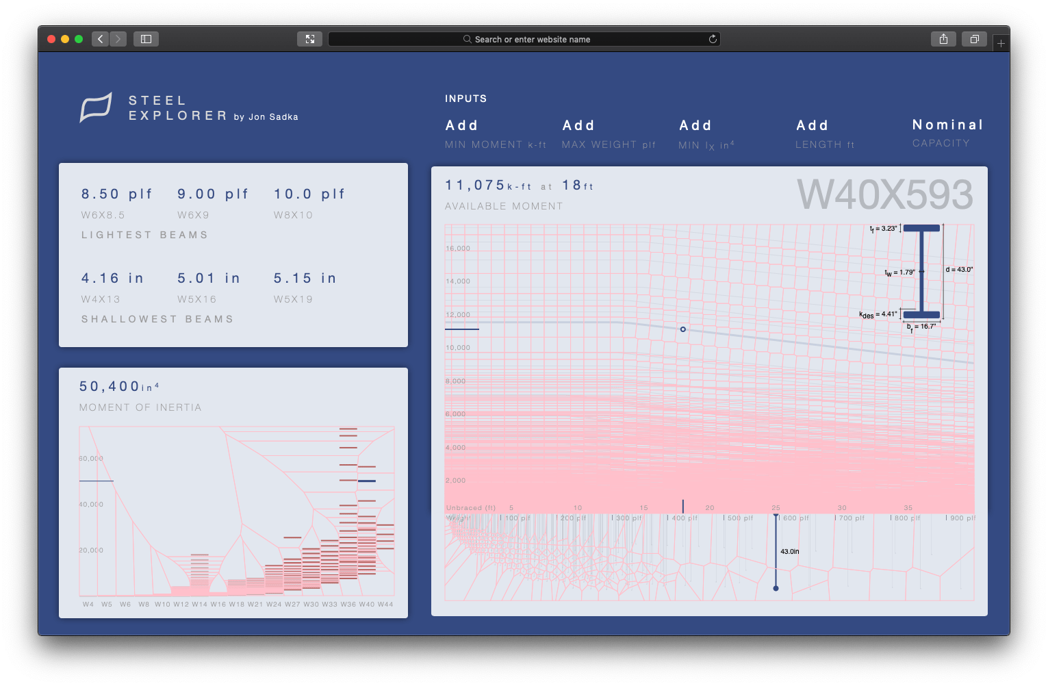
- Voronois are an incredibly precise way to add hover animations to charts, especially if those charts have a lot of datapoints. Instead of adding hover events to each element in the chart, you calculate a Voronoi diagram for the entire dataset and apply your hover events to those polygons [outlined in pink below]. I applied this Voronoi hover technique for all charts in the Steel Explorer and highly recommend it. To learn more, check out Nadieh Bremer's Using a d3 voronoi grid to improve a chart's interactive experience and explore Philippe Rivière's collection of interactive Observables. It's important to point out that using this Voronoi hover technique requires you to re-calculate the vornoi layer each time the dataset changes and also requires you to render the vornoi svg elements to the DOM. At a certain scale, this can slow down the browser, which will lead me to my next point.
-
Use canvas instead of svg to render large datasets. Performance on the zoom transitions is noticeably sluggish because I underestimated the number of elements being rendered. In retrospect I should have rendered all the charts in canvas and only rendered the Voronoi overlays in SVG. This would have dramatically improved the rendering performance, performance when transitioning, and allowed for smoother hover animations. This leads me to my next two points.
-
Computing and rendering the Voronoi layer at the scale of data on this project takes a noticeable amount of compute power and causes a brief slow down the machine. This, in conjunction with the transitions that happen when a user filters the dataset, resulted in noticeable lag. However, I realized that because the Voronoi and svg layer are two independent layers, we can actually delay the re-calculation of the Voronoi layer until after the transition of the visual elements have finished. This reduced the lag enough to a point where I felt comfortable skipping the migration from svg to canvas.
-
When filtering on the data set, using the enter and exit pattern to hide elements was less performant than simply changing the opacity of the elements to 0.
-
You should clean and condense your data set if possible. Reducing the ~2,000 line .csv of steel beams to 284 lines reduced the file size to 111kb (from 707kb). This simple optimization improved load time by several tenths of a second.
-
Migrating from d3v3 to d3v5 was relatively painless.
-
I used vanilla JavaScript, CSS and HTML instead of a framework like React or Vue because I thought it would be fun to go back to basics.
Closing
I think it's important for you, the reader, to know that I started this project over two years ago and it took a lot of time, hard work, and persistence, just like all the other projects being created and shared. The project had many struggles, many imperfections, many times where I wanted to give up, many instances where I felt like I didn't know what I was doing, and many other difficult moments.
I provide this color because often times we make up stories in our heads that the work being created by others happens so effortlessly, easily and quickly when in fact the opposite is true. Fight the feeling of imposter syndrome and remind yourself that you are totally capable of achieving whatever goals you set out for as long as you work hard and are persistent.
You are awesome.
Design evolution
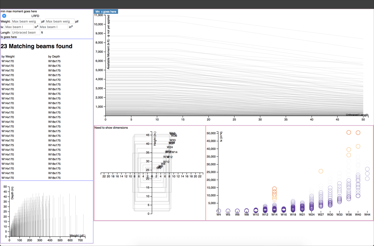
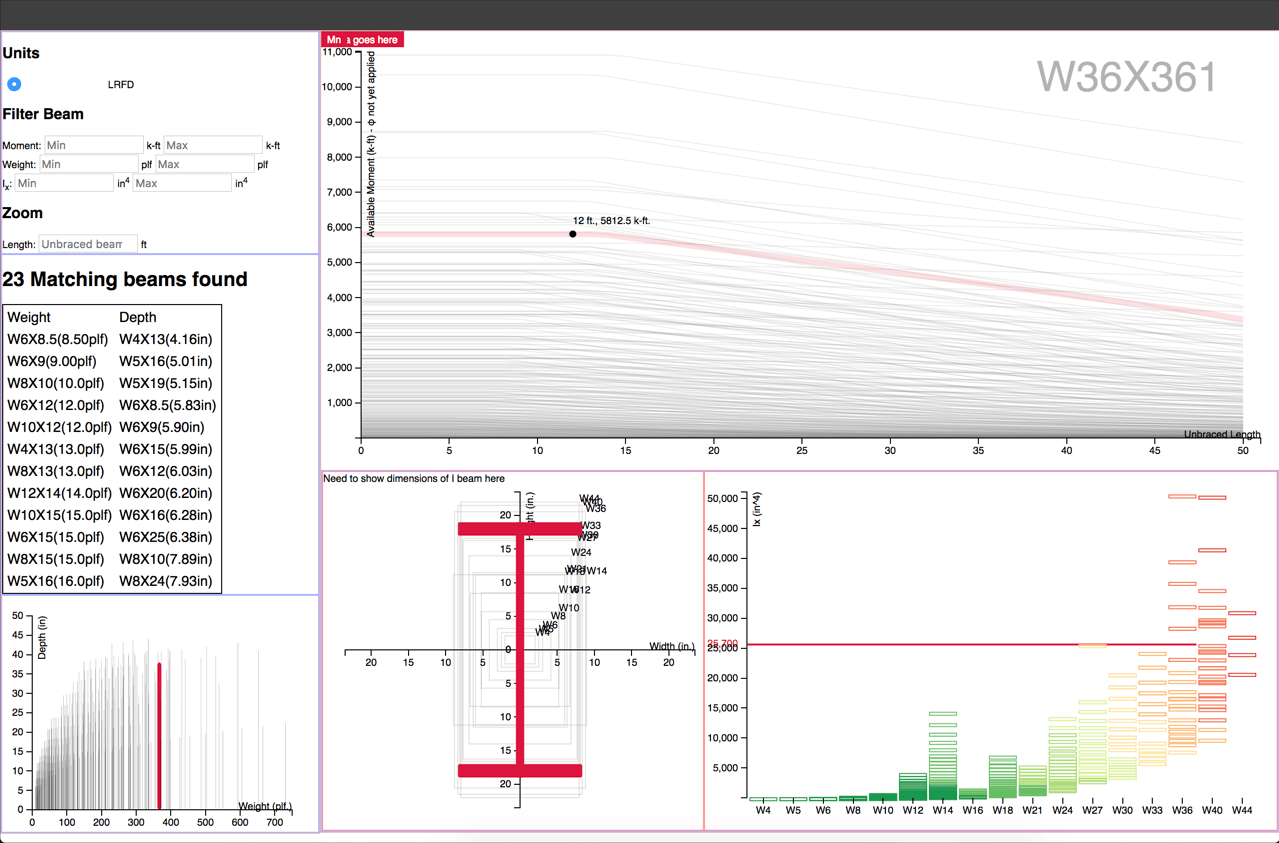
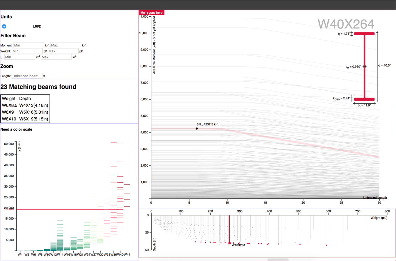
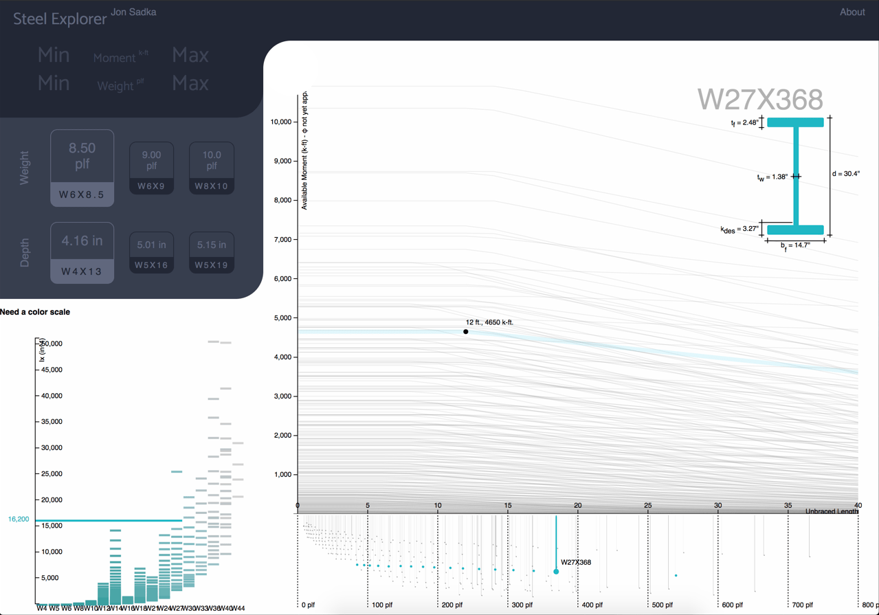
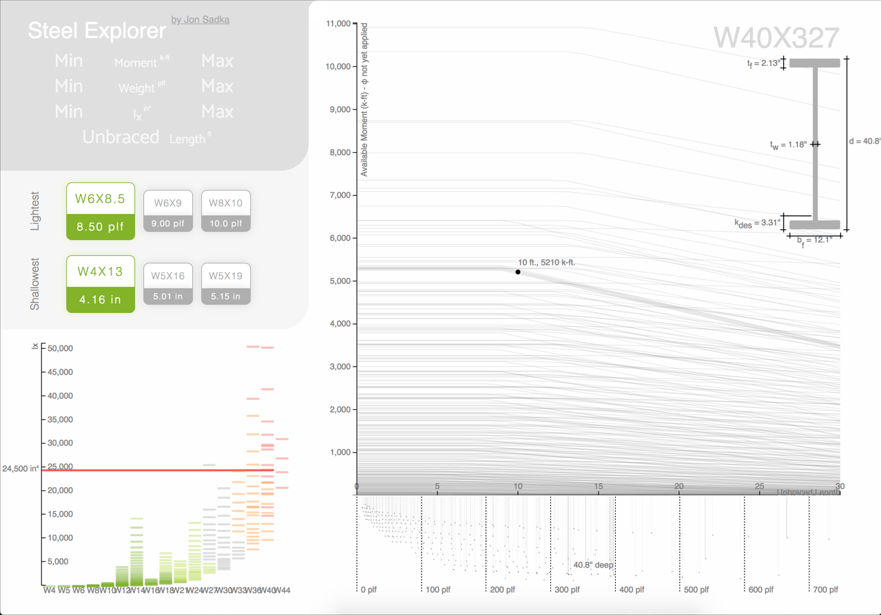
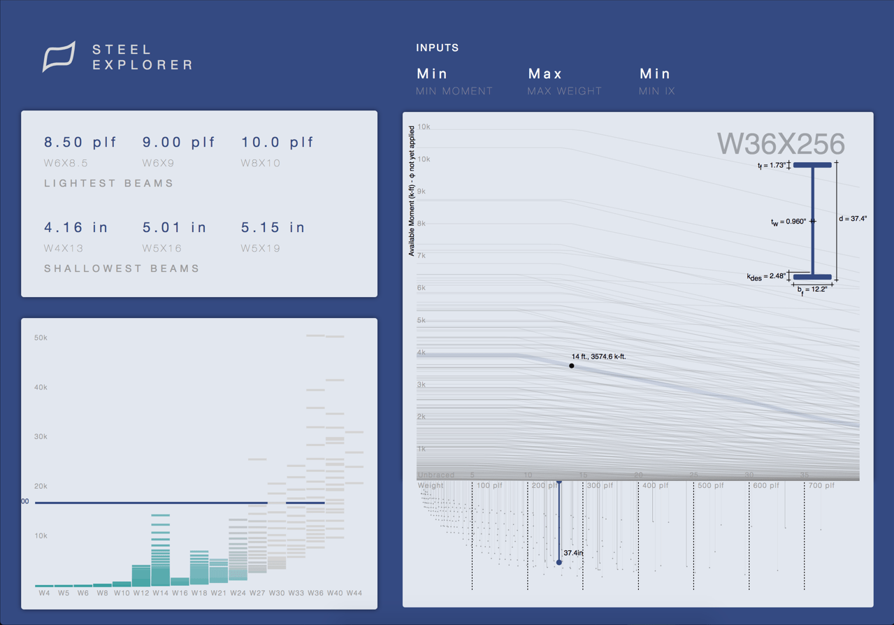
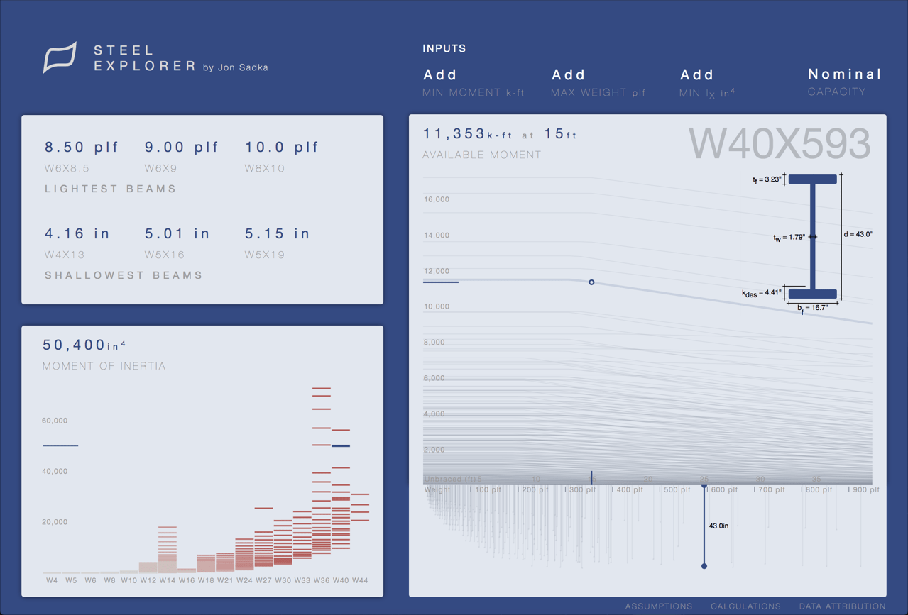
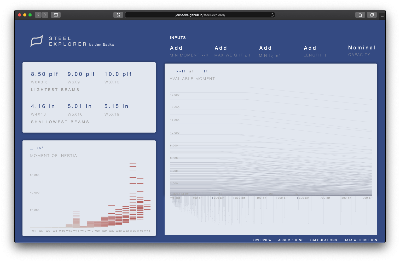
Below are screenshots of the Steel Explorer at various points in time during the development of the project, in chronological order (top left to bottom right).
